

id Brand Guidelines
This manifesto explores the relationship between work and identity by analyzing how a graphic designer identifies with the work they create.
These concepts are manifested into brand identity guidelines for an imagined luxury brand, id, that sells “The Product”: a clear cube.
Project Details
Type: Book & Installation
Dimensions: (Book) 9.5” x 12.25” x 1.5”
Year: 2019
Designer: Lena Kourgouzov
Photographer: Cat Trzaskowski


Approach
The brand itself, id, is a lifestyle brand devoid of any uniquely defining characteristics (even opting out a brand color in favor of clear). The branding is highly influenced by context and relies on the person interacting with it to project their own biases, resulting in personally assigned meaning.
id represents a holistic lifestyle and The Product is a conduit for identifying as a designer.

Logo
The basic building blocks that the logo consists of are meant to represent pureness of form that The Product itself also encapsulates. The elements that make up the logo are set an awkward distance apart and adhere to a strict 3x3 grid. All of this results in a mark that purposely appears unfinished, unrefined, and (above all) raw purity of form.

Typography
This large sans-serif typeface was chosen to represent id for both its familiar and invisible nature. Univers does not lend an enormous personality to the brand’s visual language, which allows users to interact with it with less bias and preconceptions.

The Product
Humans are sentimental creatures. We assign meaning to objects and project ourselves onto them. id’s main product, The Product*, is meant to represent pure form. The absence of color, ergonomics, and visual cues allows the user to cast judgment on The Product based on personal experience. The Product takes on the color of its surroundings, and the angle at which the user views it affects the refraction within, further individualizing the object. The personal connection a user experiences with The Product while holding it is what makes it theirs.
* Price Upon Request


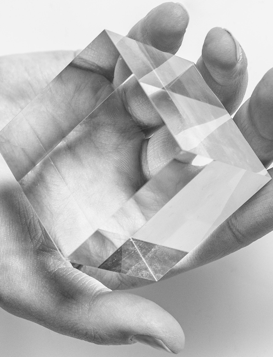
The personal connection a user experiences with The Product while holding it is what makes it theirs.


Design is thought-driven, reactionary, and,—above all—human.


id was my senior project completed at the Fashion Institute of Technology. A special thanks goes to professors Stephanie Tevonian and Sondra Graff, who guided and challenged me throughout the process.